HTML & CSS Week 6 - Glassmorphism
After 5 weeks of playing around with tags and styles, you're starting to gain confidence in manipulating the different elements of a web page. So this week, we're going to focus a bit on how to design with those elements. Maybe we've got an idea of how things should look, but how do we achieve what's in our heads
What is Glassmorphism?
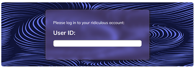
Glassmorphism is a modern user interface (UI) design trend, which presents interface elements as though they are on frosted glass. It uses tricks like transparency, blur, and rounded corners to create this impression. As well as a neat way to organise content, it can also be helpful to make text readable when it's laid over an image. It looks a bit like this:

What we're going to make is a 'card', which uses an image as a background and displays information in a glass panel laid over the top. Have a look here to see an example:
Craft a card
First of all find a nice image, or a pattern, to act as your backdrop. Pick something you like, something you've got something to say about. Cats, or Roblox, or carrots, say. Download that, and note its size. Then make a div, somewhere in your main content, and give it a class - let's call it 'card' This is the one that will hold our picture.
Inside that div, we'll make another div, and we'll give it a class 'panel', and this is the one we're going to glassify and put our text in.
<div class="card">
<div class="panel">
Your text is going to go in here
</div>
</div>
Styling the card
We could just put the picture in the card using an <img> tag, but it's easier to set it as a background. That way it doesn't get in the way of anything else - everything we put in the panel will be on top of it, without us having to specially make it so. Then we're going to give it height and width, so that it's always the size we want. Then we'll give it margins so that it sits where we want. So put something like this within your style tags:
.card {
    margin: 20px auto 20px auto;
    position: relative;
    background-image: url(kitten.jpg);
    width: 700px;
	height: 621px;
}
Explanation:
- The margin style puts a 20px gap above and below, and centres it horizontally
- position:relative is not strictly necessary, but it lets us position our panel relative to the card
- This sets your image as background - use the file name of your image, not 'kitten.jpg'(!)
- Set the width and height to the size of your image. If your image is too big, you can resize it. Or use more styles to make it shrink or stretch to fit (ask for help!)
Styling the panel - some new concepts
Next we'll style the panel. We could make it semi-transparent using the opacity style, but this would affect our text too, making it faint and hard to read. So we're going to use a different way of defining the background colour - RGBA. We're also going to use absolute positioning
RGBA: We've looked at RGB colours before, they look like this: rgb(125, 240, 140). The first number is the amount of red, the second the green, the third the blue, all numbers being between 0 and 255. RGBA looks very similar rgba(125, 240, 140, 0.25), but the 4th number goes between 0 and 1, and describes the alpha property: that is, how opaque it is. 0 is completely transparent, 1 is completely opaque.
Absolute positioning: When an element is positioned absolutely, it floats above the rest of the page. We don't strictly need it here, as our image is a background, so doesn't take up any space. but it means we could put more content in our card without affecting the panel. Also, the panel doesn't affect anything else, so we can add as many as we like. We position absolute elements using top, bottom, left and right, to define how far they are from each of those edges. The edges are the edges of the nearest parent that has relative positioning. So by making our card position:relative;, if we give our panel top:40px it will be 40 px from the top of the card.
So let's style the panel:
.panel {
	position:absolute;
	bottom:50px; left:50px;
	width:380px;
	background-color: rgba(160, 160, 160, 0.3);
	border-radius:10px;
	color:white;
	padding:20px 20px;
	backdrop-filter: blur(20px);
}

Taking it further
These are the basic styles you need to make it work, but there are others you can add to improve the look
- Download a better font from fonts.google
- Change the positioning and even add more panels
- Tweak the RGBA colour to give it a tint, or the opacity, or the border radius
- Add a shadow, or even a glow, using box-shadow style
box-shadow: 5px 5px 10px 1px rgb(40, 27, 27); - Play around with borders:
border: 1px solid rgba(255, 255, 255, .25); - Stack up multiple filters to change the background effect
backdrop-filter: blur(20px) saturate(180%);
