Instructions for building the Fact Cards
Last week we built a basic web page featuring a body with a div centred in it. The div had a size and width to resemble a card. All of our content is going to be on this card, but first of all wer're going to finish styling it.
So we've all got two files, an HTML file and a CSS file. The HTML file contains a single <div> within the body, and that div has been given a class, "card". We've written CSS for the card class, to set it's size and centre it in the page. Your files should look something like this:
card.html
<body>
  <div class='card'>

    Hello!

  </div>

</body>
cardstyle.css
.card {
position:absolute;
width:700px;
height:890px;
top:0;
bottom:0;
left:0;
right:0;
margin:auto;
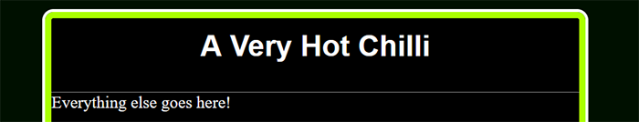
}The next thing we're going to do is give it some borders, using - you guessed it - the border CSS property. You can specify the properties of a border separately, but like many CSS properties there's a short-hand way to set the main properties altogether. They are width (border thickness), style and colour, and we set them like this:
border:6px solid #aaff00;
Next, we're going to give it rounded corners, because it looks good, and that's what real cards have (to protect the corners from getting damaged). The property for this is border-radius, and it turns the corner into part of a cirle with the radius you set (fun fact - if you set it to 50%, the whole card becomes round!).
border-radius: 8px;
Finally, it still feels a little flat, so I'd like to add another border around the edge. Sadly, you can only have one border - if you add another, it just replaces the first. But there's another property we can use: outline. this will draw an outline around the border, and we use it in the exact same way:
outline: 3px solid #fff;
Add all of these into your .card{} declaration (in the stylsheet file, of course), and you should get a border that looks something like this:

The divs in the divs
Like most HTML tags, divs can be nested within one another. We can use this to split our card into a title and a main area. So that we can style our divs separately, we'll give each one a class. Then we'll add some simple styles for the first div. Because it's inside the card div, it will automatically be the same width, so we don't need to add anything there. But we want it to have a fixed height. And let's add a border to the bottom, so we can see where it ends. Add the styles beneath the styles for the card class.
I'm also going to add a single style for the card-body div. I'm going to add height, and the reason for this is that I
want to make sure it fills the rest of the space. Otherwise the picture won't fill the space, and it will look a bit
silly. The card is 700px high, and the title is 60, so the height should be:
700 - 60 = 640
card.html
<body>
  <div class='card'>

    <div class='card-title'>
        Title goes here!
    </div>

    <div class='card-body'>
        Everything else goes here!
    </div>

  </div>

</body>
cardstyle.css
.card-title {
  height:60px;
  border-bottom: 1px solid #777777;
}

.card-body {
  height:640px;
}
Styling the title
We'll start off with the title box, and the actual name of the card. I'm going to put in an h1 tag, because it's the main title, and we try to use tags that reflect the meaning of the element, and how it relates to the page. But I might want to use h1 elsewhere too, so to make sure these styles only apply to the h1 inside the card, I'll write it like this:
.card h1 {
}
What that says is that the following styles apply to any h1 tag which is inside, or a child of, something with the card-title class. To explain the order of nested tags, we call the element on the inside the child, and the element around it the parent. We can also refer to siblings, grandchildren etc, and this has all kinds of uses. By default, a heading tag stretches across the whole width of its parent, so if we want to centre the text, we're centering it within the tag, and we can use text-align for this. We want a bit of space above it, so we'll use margin-top to make that. Then we'll style the font a bit. Add this
card.html
<div class='card-title'>
        <h1>A Very Hot Chilli</h1>
    </div>
cardstyle.css
.card h1 {
  font-family: 'Helvetica', system-ui;
  color:#fff;
  font-size:28px;
  text-align:center;
  margin-top: 10px;

}
That should give us something like this:
The rest of the card
We'll come back to the title later, but let's move on the the card body. We want to get an image in there, and that's easy enough - we've already seen how to add an image to a web page. The problem is, an image takes up space; how are we going to write on top of it? Well, there are lots of ways, but a very easy one is to set it as the background. Just like we can give an element a background colour, we can also give it a background image. Find an image, ideally one that's about the right size and shape, and add it to the folder with your other files. Then add themissing rules shown below to your card-body class
cardstyle.css
.card-body {
  height:640px;
  background-image: url('moorhen.jpeg');
  background-size: cover;
  background-position: center;
  position:relative;
}
These are mostly self-explanatory: we tell it to use a background image, specifying where it is (the URL). We set the size, using the special value cover, which makes it fill the space without stretching or squashing it. Because this sizing might mean that the image is too wide or too long for the div, we then centre it so that we're only losing the edges.
There's one last rule that we're adding here, which doesn't appear to do anything: position: relative. That is important for our next bit. Because the fact boxes don't just go down the page, or across it, in a line; they are positioned very carefully. We are going to position them absolutely. And when you position something absolutely, you need to know what it's positioned relative to. For us, it will be easiest to place them relative to the card body; 30 pixels from the right, say, and 200 from the top. an absolute element will be positioned relative to it's nearest relative parent. That's why we make the card-body relative.
And that's a fact!
Now that we've got our card body, let's add a fact box. This will also be a div, but we'll set the position to absolute. We'll add this inbetween the tags for your card body, like so, along with a style declaraion in the stylesheet:
card.html
<div class='card-body'>

      <div class='fact'>
        Here's my first fact! It's too long for a single line :(
      </div>

    </div>
cardstyle.css
.card .fact {
  position:absolute;
  background-color: #b5efec;
  border-radius: 8px;
  color:#000;
  font-family: 'Helvetica', system-ui;
  font-size:10px;
}
We've given the fact box a colour, set the font and size, and rounded the corners - all stuff you've done before. You can play around with these later, but first we're going to add 2 more styles, padding and box-shadow. Padding is part of the 'box model', and I'll explain that more below. For now, add the following to your fact class to leave a gap around the text
padding:6px;
Box-shadow will make the fact box 'pop' off the page by putting a shadow behind it. In the declaration below the first two numbers are the x and y offsets, moving the shadow 3 pixels to the left, and 3 down. The next number is the amount of blur, and the last is the shadow colour. You can see there's something different about the way we've defined the colour - we've used rgba, which takes 4 parameters. The first 3, like with regular rgb, are decimal values for red, green and blue, but the 4th is a number between 0 and 1 called the opacity. 0 is completely transparent - you can't see it at all - and 1 is completely opaque. In between, it becomes more transparent the lower the number is.
box-shadow: -3px 3px 4px rgba(0, 0, 0, 0.7);
Play around with these numbers until you have something that works with your background.
Aside - The Box Model
When we postion and format objects in CSS we use something called the box model. Imagine a box with some content in it. In our case the box is a div, and the content is the text of our fact.The following properties all affect the space around that content:
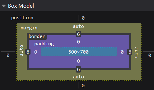
- Position - used for placing absolutely-positioned elements; we're about to get to that...
- Margin - the space around the box
- Border - the thickness of the box's sides
- Padding - the space between the box and it's contents
We can specify each side of the box separately, like: border-bottom: 1px, or we can use shorthand, to specify all the sides at once:
ID know
We're going to have lots of facts, and they can all use the same class so that they share the same style. But they're all going to be in different positions, and maybe different sizes, so how do we style that? We'll use another attribute, id. An id works a bit like a class, except each id can only be used once on a page. This makes it good for targeting a specific element. Change the HTML of your fact div so it looks like this:
<div class='fact' id='fact1'>
Now we're going to stick some styles to that id. We denote classes in our stylesheet by putting a dot in front of them; for ids, we use a '#'. Add this to your stylesheet:
cardstyle.css
#fact1 {
  width:110px;
  top:30px;
  left:20px;
}
If you remember, we set the card-body to be relative, and that's the nearest 'relative' parent of our fact box, so everything is positioned relative to that. We're saying, "Make the fact1 box 110 pixels wide, then position it 30 pixels from the top edge of the card-body, and 20 pixels from the left."
You can now add any number of fact boxes, and by giving each one a different id, you can position and size it however you want:
card.html
<div class='fact' id='fact2'>
  Chillies are hot so that they burn birds' bottoms
  on the way out. That makes them clench for as long
  as they can, so the seeds get spread further
  from the parent plant
</div>
cardstyle.css
#fact2 {
  top:40px;
  right:20px;
  width:170px;
}
The font of all knowledge
Let's go back up to the title, and pretty that up a bit. I'm going to add a little tagline, "Is that a fact?", to give my brand some identity. And I'll make it stand out with a fancy font. We might know what fonts we have on our computer, but unless the same one is on our web server, it won't display. We can get around this by downloading fonts from Google.
First, we'll make the text and a style to go with it. We can use <h2> - put this inside the card-title div, and add some styles to the CSS:
card.html
<h2>
    "Is that<br>
    a FACT?!"
  </h2>
</div>
cardstyle.css
.card h2 {
  margin: 0;
  position: absolute;
  right: 10px;
  top: 12px;
}
The <br> tag simply breaks our text into a new line. Again, we've used position:absolute to control where it appears, and we've set the margin to 0 so that it doesn't affect the position.
Point your browser to fonts.google.com. Find a font that you like, and click it (I chose Bangers). Then click the 'Get font' button, followed by 'Get embed code'. Copy the lines that start with <link... , and paste them between the head tags in your HTML. That tells the browser to download the font. Now copy the "font-family" line, and paste it into your h2 CSS. We'll change the font size and colour while we're at it.
card.html
<head>
  <title>Fact Cards!</title>
  <link rel="stylesheet" href="cardstyle.css">
  <link rel="preconnect" href="https://fonts.googleapis.com">
  <link rel="preconnect" href="https://fonts.gstatic.com" crossorigin>
  <link href="https://fonts.googleapis.com/css2?family=Bangers&display=swap" rel="stylesheet">
</head>
cardstyle.css
.card h2 {
  position: absolute;
  right: 10px;
  font-family: 'Bangers', system-ui;
  color: #aaff00;
  font-size: 20px;
}
You might have to play with the size and position, depending what font you've chosen.
Slanted is enchanted
A final flourish in the title area. Let's balance things out with some text on the left to brand the cards properly. I'm going to put this in a div, and give it an id of "splash", because we're splashing our card brand onto it. This is going to work just like our h2 bit.
card.html
<div id="splash">
  Fact<br>
  Cards!
</div>
cardstyle.css
.card #splash {
position: absolute;
  font-family: 'Bangers', system-ui;
  font-size: 34px;
  color: #aaff00;
  text-align: center;
  left: 0px;
  top: 10px;
}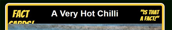
That's a bit boring, and the bottom has been cut off because it doesn't fit in the title area. To 'splash' it up a bit I'm going to use rotate to set the div at a jaunty angle. But how to make it rise above the box it's in? Well, absolute elements have a property called z-index, and just like x and y tell you how far across or down the page something is, z denotes how far above it is. You can lay elements on top or underneath one another, so all we need to do is boost the z-index to ensure it's above the other layers. Add these to the splash div styles:
cardstyle.css
rotate: -30deg;
z-index: 10;
One last trick
I've squeezed a lot of text into those fact boxes, which I've done by making it small. But it's not so easy to read. What if we made it bigger when we moused over it? There are special selectors in CSS, called pseudo-elements, and the one we'll use is :hover. The :hover rule lets us change the styles when the cursor hovers above it. We'll transform our facts, by scaling them up. There's a problem though: they might no longer fit on the card. So we'll decide which point they grow from. To do this, we'll have to target each fact individually, so we can decide whether we want it to expand from the left or the right (or even a corner). Add one of these for each of your facts, changing the transform-origin to whatever works best:
cardstyle.css
#fact1:hover {
  transform-origin: left;
  transform: scale(150%);
}
And you're done!
In just a few chunks of HTML, we've created a complex and interesting layout by applying some nifty stylesheet rules. Now finish your facts and tweak your styles till everything is to your liking, and check back here in a few days time to see all your work on the big old web!
In case you got lost, here's all the code
card.html
<html>

  <head>
    <title>Fact Cards!</title>
    <link rel="stylesheet" href="cardstyle.css">
    <link rel="preconnect" href="https://fonts.googleapis.com">
    <link rel="preconnect" href="https://fonts.gstatic.com" crossorigin>
    <link href="https://fonts.googleapis.com/css2?family=Bangers&display=swap" rel="stylesheet">
  </head>

  <body>

  <div class='card'>

    <div class='card-title'>

      <h1>A Very Hot Chilli</h1>
      <div id="splash">
        Fact<br>
        Cards!
      </div>
      <h2>
      "Is that<br>
      a FACT?!"
      </h2>

    </div>

    <div class='card-body'>

      <div class='fact' id='fact1'>
        Chillies originated in South America, and the only country there that
        doesn't much eat them is ironically called Chile
      </div>

      <div class='fact' id='fact2'>
        The chilli was invented by Peter Chilli, who brought it back from the Americas
        in the 16th century. It was presented to Queen Elizabeth I, who burnt her
        mouth so painfully she had Peter decapitated on the spot.
      </div>

      <div class='fact' id='fact3'>
        The hottest chilli in the world, the Miserable Deathberry, can only be
        eaten raw because it sets fire to any pan you try to cook it in
      </div>

      <div class='fact' id='fact4'>
        Not all chillies are hot - the Peruvian Snowdrop is the coolest, and was
        used for centuries by tribespeople to freeze food
      </div>

      <div class='fact' id='fact5'>
        Chillies contain more than twice as much vitamin C per 100g as oranges.
        A single Jalapeño contains more vitamin C than a whole capybara.
      </div>

      <div class='fact' id='fact6'>
        The chilli in the picture is called a Fatalii, and has an average heat
        around 250,000 SHU. With it's fruit flavour and cheerful colour you can
        eat it just like a banana, but you certainly shouldn't.
      </div>


      <div class='fact' id='fact7'>
        Chillies are hot so that they burn birds' bottoms on the way out.
        That makes them clench for as long as they can, so the seeds get spread further
        from the parent plant
      </div>

    </div>


  </div>


  </body>
</html>
cardstyle.css
body {
  background-color:#001000;
  color:#ffffff;
  height:100%;
  margin:0;
  padding:0;

}

.card {
  width:500px;
  height:700px;
  background-color:#000;
  border: 6px solid #ffcc33;
  border-radius: 10px;
  outline: 3px solid white;
  /* box-sizing: content-box; */
  overflow:hidden;
  position: absolute;
  top:0;
  bottom: 0;
  left: 0;
  right: 0;
  margin: auto;
}

.card-title {
  height:60px;
  border-bottom: 1px solid #777777;
}

.card h1 {
	font-family:'helvetica',system-ui;
	color:#fff;
	font-size:28px;
	text-align:center;
  margin-top: 0;
  padding-top:10px;
}
.card h2 {
  margin: 0;
  position: absolute;
  right: 10px;
  top:12px;
  font-family: 'Bangers', system-ui;
  color: #ffdd44;
  font-size: 20px;
}
.card #splash {
  position: absolute;
  font-family: 'Bangers', system-ui;
  font-size: 34px;
  color: #ffdd44;
  text-align: center;
  left: 0px;
  top: 10px;
  rotate: -30deg;
  z-index: 10;
}

.card-body {
  height:640px;
  background-image: url('fatalii.jpg');
  background-size: cover;
  background-position: center;
  position:relative;
}

.card .fact {
  position:absolute;
  background-color: #b5efec;
  border-radius: 8px;
  color:#000;
  font-family: 'Helvetica', system-ui;
  font-size:10px;
  padding:6px;
  box-shadow: -3px 3px 4px rgba(0, 0, 0, 0.7);
  z-index:11;
}

/* .card .fact:hover {
  transform-origin: left;
  transform: scale(150%);
  z-index:11;
  right:50%
} */

#fact1 {
  top:50px;
  left:30px;
  width:140px;
}

#fact2 {
  top:20px;
  right:20px;
  width:170px;
}

#fact3 {
  top:240px;
  left:15px;
  width:110px;
}

#fact4 {
  top:170px;
  right:20px;
  width:120px;
}

#fact5 {
  top:360px;
  right:20px;
  width:120px;
}

#fact6 {
  bottom:25px;
  right:30px;
  width:162px;
}

#fact7 {
  bottom:90px;
  left:30px;
  width:140px;
}

#fact1:hover {
  transform-origin: left;
  transform: scale(150%);
}

#fact2:hover {
  transform-origin: top right;
  transform: scale(150%);
}
#fact3:hover {
  transform-origin: left;
  transform: scale(150%);
}
#fact4:hover {
  transform-origin: right;
  transform: scale(150%);
}
#fact5:hover {
  transform-origin: right;
  transform: scale(150%);
}
#fact6:hover {
  transform-origin: bottom right;
  transform: scale(150%);
}
#fact7:hover {
  transform-origin: left;
  transform: scale(150%);
}